Lumion Files
Sketchup Files
Image Captures
Flythrough
Moving Elements
Drafts and Concept
36 Custom Textures
18 Sketch Perspectives
3 Article Mashup
Anna-purna - Design Studio Blog
Monday, 29 June 2015
Image Captures
 |
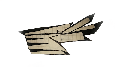
| Site Plan: The architecture is a series of interconnecting geometric shapes, linked by a series of angular asymmetric bridges. |
 |
| Site from aerial view. |
 |
| Architecture as viewed from UNSW Campus towards NIDA |
 |
| One of the 6 angular linking bridges between the lecture theaters and student workshops and meeting area. |
 |
| Above, Library, Below Gallery Space, both connected by a hexagonal elevator enclosed in an organic yet angular trunk form. |
 |
| Library space and study areas. |
 |
| Gallery and exhibition space. |
 |
| Staff offices and meeting areas |
 |
| One of two meeting rooms featuring my rotational texture. |
 |
| Student reaserch space and computer labs below. |
 |
| Student reserch space internally viewed, featuring my linear texture. |
 |
| Lecture theatres connected through two tubular spiral staircases. |
 |
| Internal view of lecture theater. |
 |
| Roof gardens used to increase the environmental impact of the structure and reduce CO2 emissions. |
 |
| Bridge leading from computer labs to library and gallery space. |
 |
| Elevator between Gallery and Library featuring my Scalar texture, an ironic wood imitation print on concrete |
 |
| Rooftop Garden on research lab segment, |
Drafts and Concept
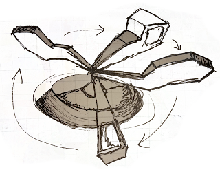
 Inspired by my article mashup, I decided to follow a theme of environmental conservation paired with the immediate psychological benefits of ecological diversity and integration. In tutorial class we were asked to draw elevations inspired by section plans, this was the thought process behind my first design, a series of stacked rotating segments:
 I decided to base my final design on these same segments rotated about the vertical axis in hexagonal design, similarly to my draft, however i separated them to create individual pod like structures.
Moving Elements
36 Custom Textures
Subscribe to:
Comments (Atom)


